Order from Whoop distro and choose your own color
(Silly bonus: we only use recycled envelopes)
The organizer comes in three formats:

Pocket (4.5 X 5.5 inches) original paperback book binding
The pocket version “classic” is a 176 page pocket planner (4.25 inches X 5.5 inches) with radical dates for every day of the year, space to write your phone numbers, a contact list of radical groups around the globe, menstrual calendar, info on police repression, extra note pages, plus much more. Choose from 18 cover colors printed with either black or silver ink (depending on how dark the paper stock is). It has a tough layflat binding and a laminated cover.
Pocket-Spiral Mutant (4.5 X 5.5 inches) with spiral binding
Spiral bound pocket version (4.25 inches X 5.5 inches) – “Slingshot Mutant” – durable spiral “plasticoil” binding. Contains radical dates for every day of the year, space to write your phone numbers, a contact list of radical groups around the globe, menstrual calendar, info on police repression, extra note pages, plus much more. Choose from 18 cover colors. Covers are laminated on both sides.
Spiral Bound Desk Calendar (5.5 X 8.5 inches)
The large-size version is bound with a super tough tough plasticoil binding and is twice the size of the “classic” pocket organizer (5.5 inches X 8.5 inches) with twice as much space to write all the events in your life. It is 176 pages featuring radical dates for every day of the year, space to write your phone numbers, a contact list of radical groups around the globe, menstrual calendar, info on police repression, extra note pages, plus much more. You get a little bonus stuff in the spiral version. The spiral version is available in 18 colors printed with either black or silver ink (depending on how dark the paper stock is). The covers are laminated with heavy duty 3 mil glossy plastic to help it survive the year.
One Pocket Organizer (7.50 + Shipping):
***ANNOYING PayPal problem they cannot fix — I cannot receive your color selection or if you want a zine subscription that you type in. Either add the color to your address or name, or please email your info to “whoopdistro@protonmail.com” — sorry for the extra hassle***
One Pocket-Spiral Mutant ($11.50 + shipping)
***ANNOYING PayPal problem they cannot fix — I cannot receive your color selection or if you want a zine subscription that you type in. Either add the color to your address or name, or please email your info to “whoopdistro@protonmail.com” — sorry for the extra hassle***
One Spiral Organizer ($15.00 + Shipping):
***ANNOYING PayPal problem they cannot fix — I cannot receive your color selection or if you want a zine subscription that you type in. Either add the color to your address or name, or please email your info to “whoopdistro@protonmail.com” — sorry for the extra hassle***
Three Pocket Organizers ($21.00 + Shipping): ($7.00 per copy, plus shipping)
***ANNOYING PayPal problem – standby while we attempt to fix it ***
Three Pocket-Spiral Mutant ($30 + shipping)
***ANNOYING PayPal problem – standby while we attempt to fix it***
Three Spiral Organizers ($40 + Shipping) ($13.33 per copy, plus shipping)
***ANNOYING PayPal problem – standby while we attempt to fix it
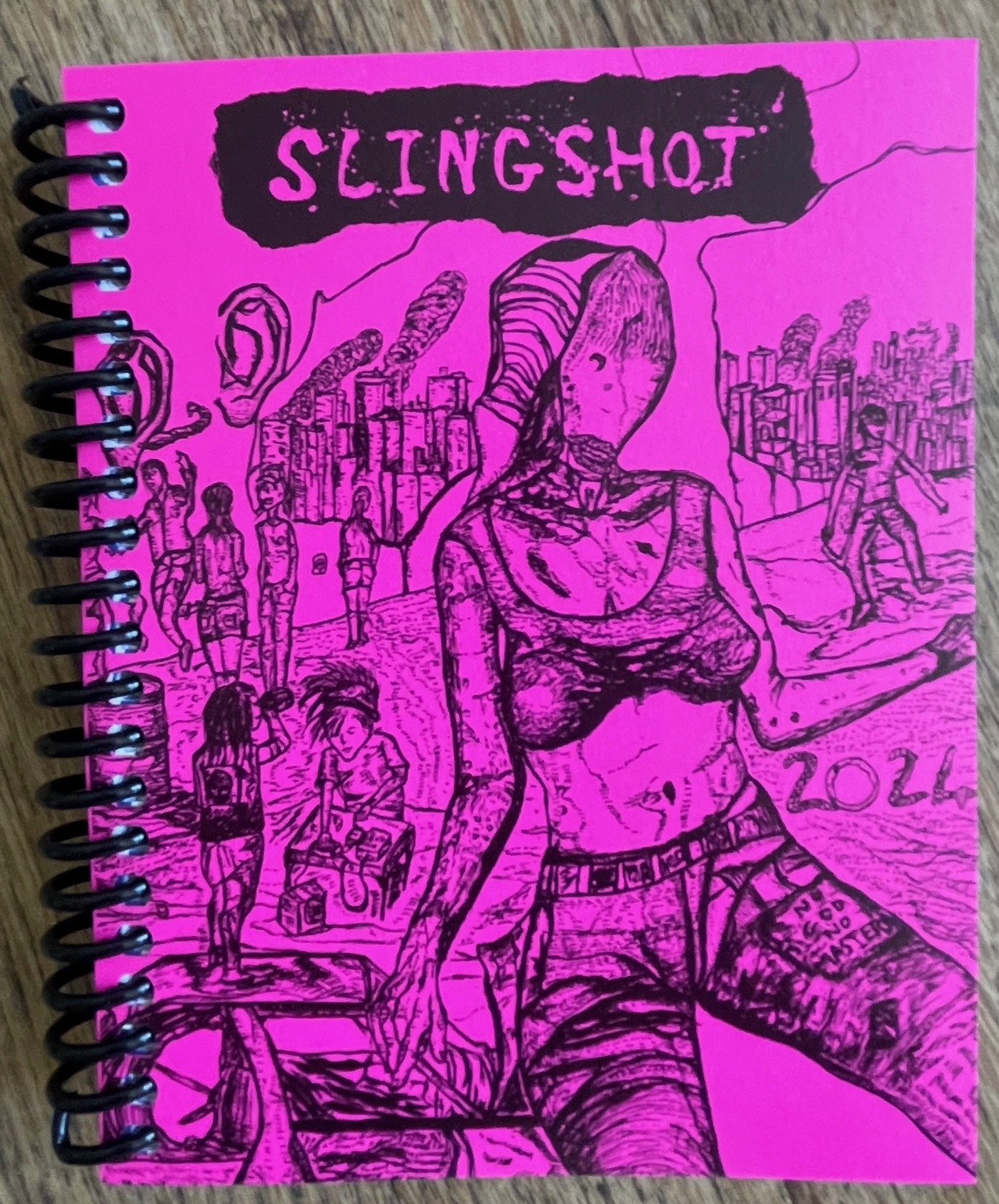
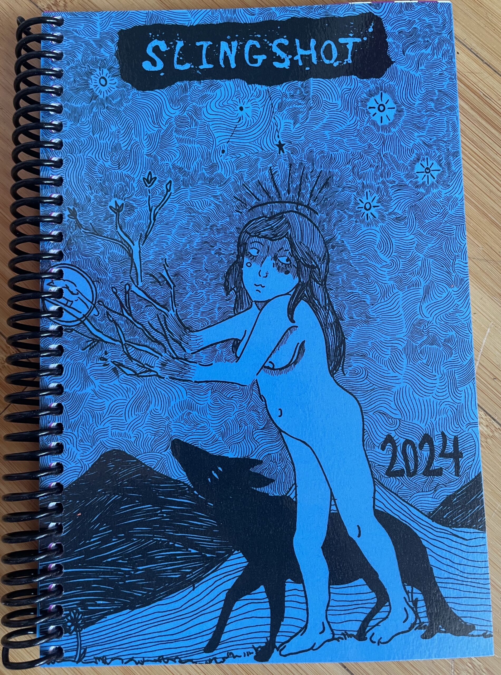
Slingshot collective official color names for the 2024 Organizer:
Pink Triangle (lighter pink)
Pinko (hot pink)
Red Emma
Grassroots (olive green-ish)
Food Not Lawns (kelly green)
Green New Deal (lime green)
Stone Butch Blue
Water is life blue (lighter blue)
Black Lives Matter (black paper with silver ink)
John Brown (brown paper with silver ink)
Don’t pee in the drinking water (bright yellow)
Go solar (gold yellow)
Purple House
Grape Boycott
Teleology
Orange you glad this isn’t an iphone
Acorn squash the state
Bourgeois blues (dark blue with silver ink)
MORE INFO
Single pocket copies ship first class mail; single spiral orders and all orders bigger than single spiral copies ship media mail rate within 3 days after we receive your order. If you select priority shipping, we will send single copies of the spiral or pocket first class mail and anything larger we will ship priority mail. First class generally takes 3-7 days; priority takes 2-3 days; media mail generally takes 10 to 14 days after we mail it, so allow 30 days after sending your order for shipping,
although it is usually way faster. Please contact us if you don’t get your
organizer within 30 days of sending your order. Stuff does get lost although it doesn’t happen often.
If you order stuff after November 26, you may not get it until after
December 25 because the mail system gets crazy that time of year.
Sorry. We’ll do our best to send it, but after that it’s out of our hands.
Email us if you want more than 3 copies.
If you have problems please email “whoopdistro [at] protonmail [dot] com”